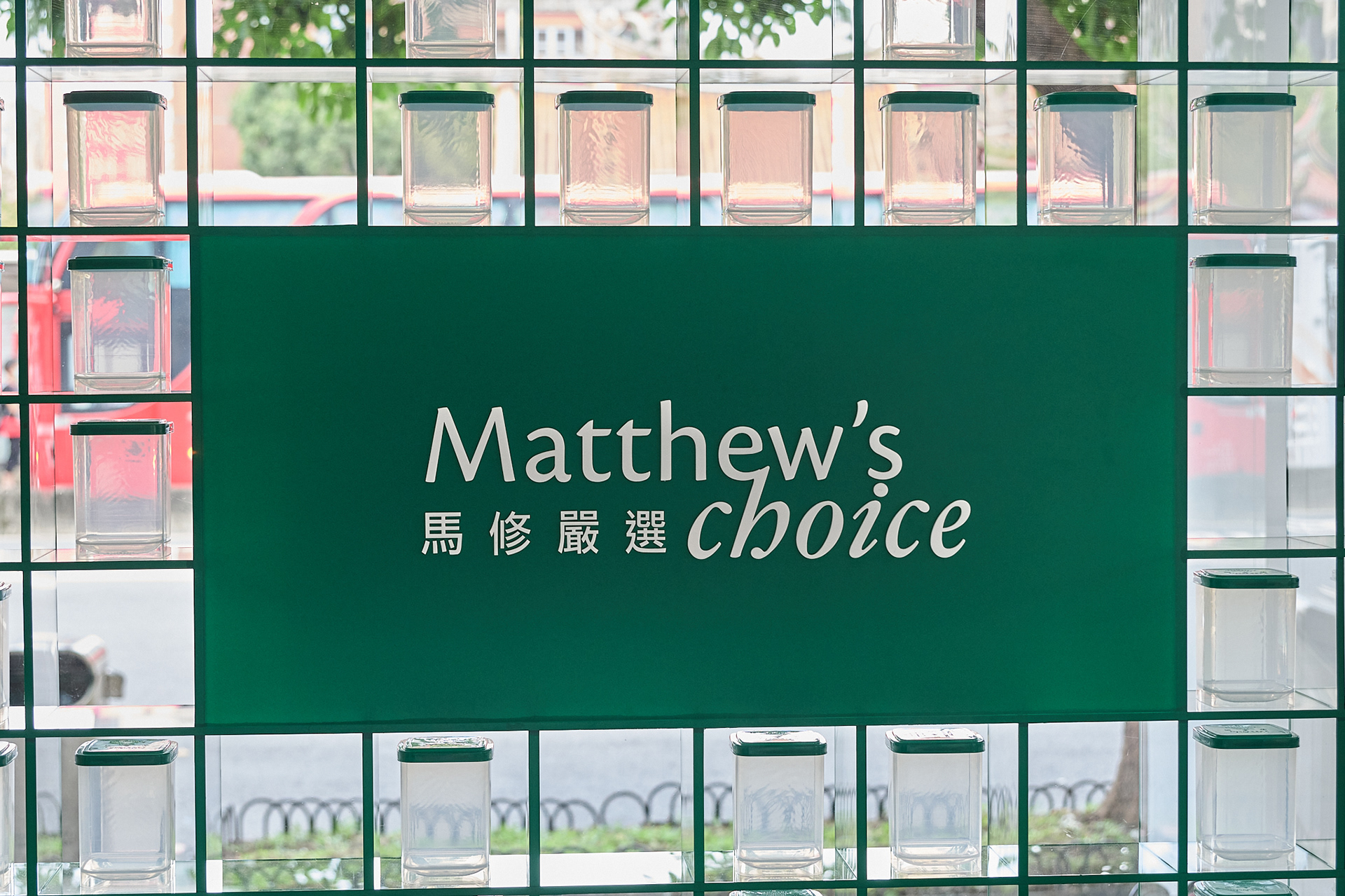
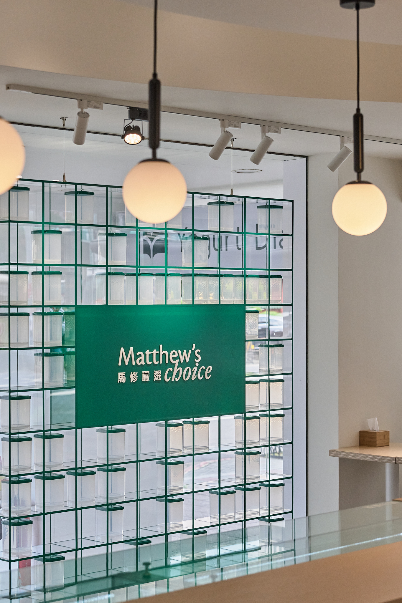
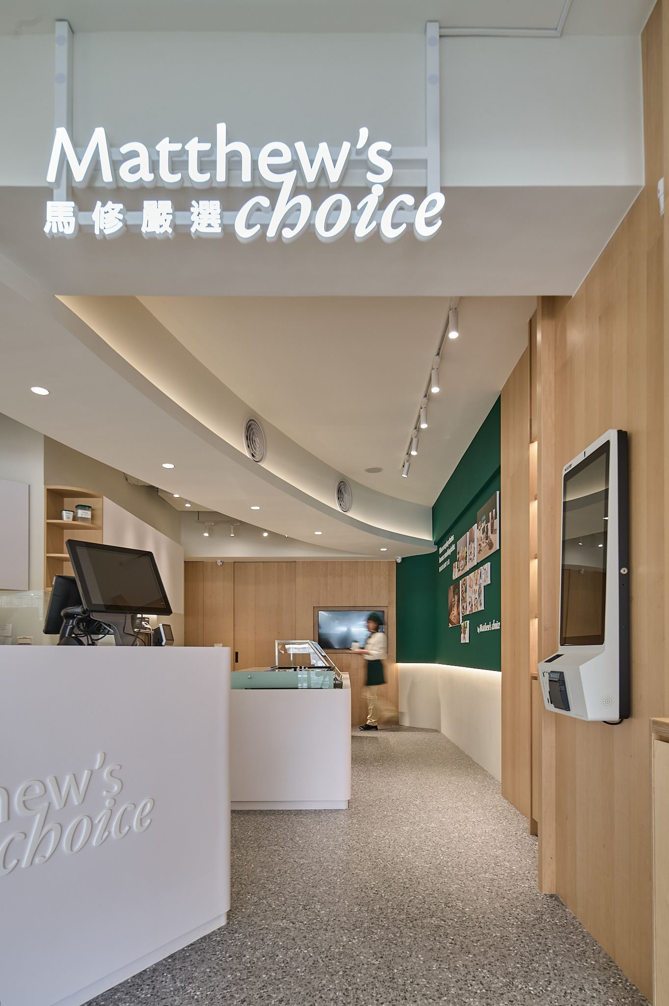
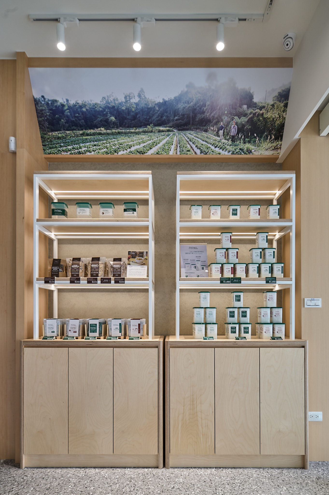
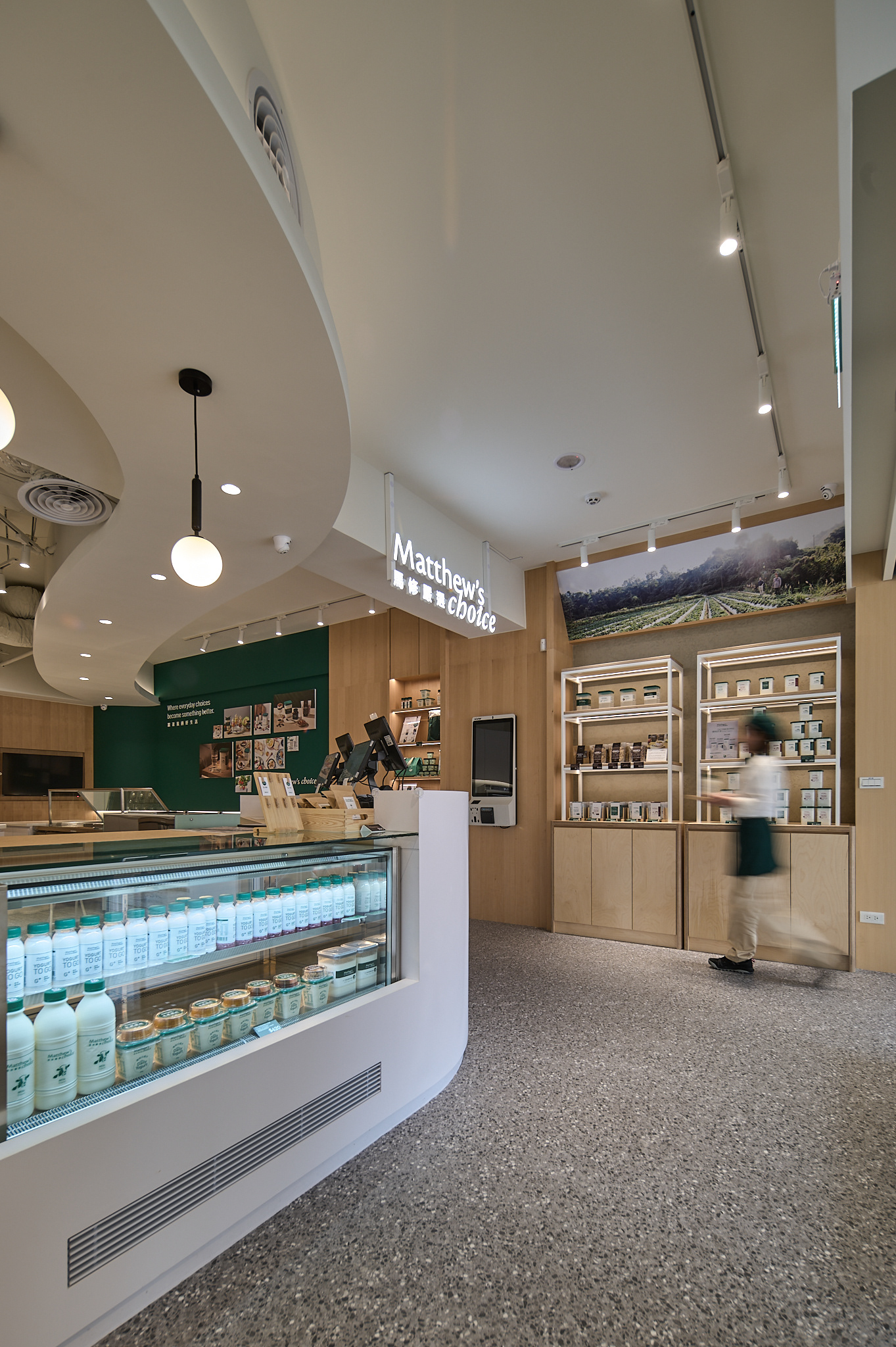
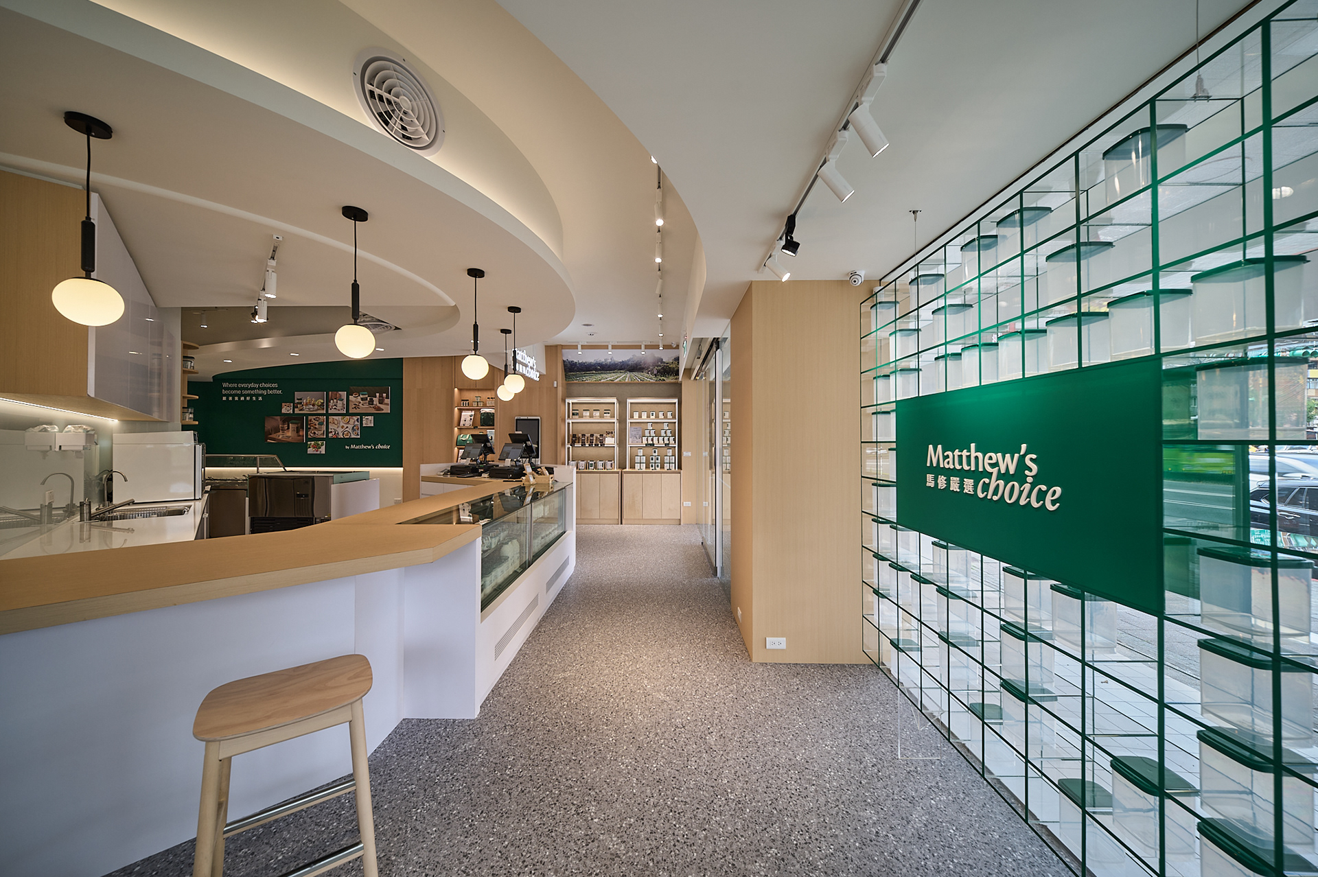
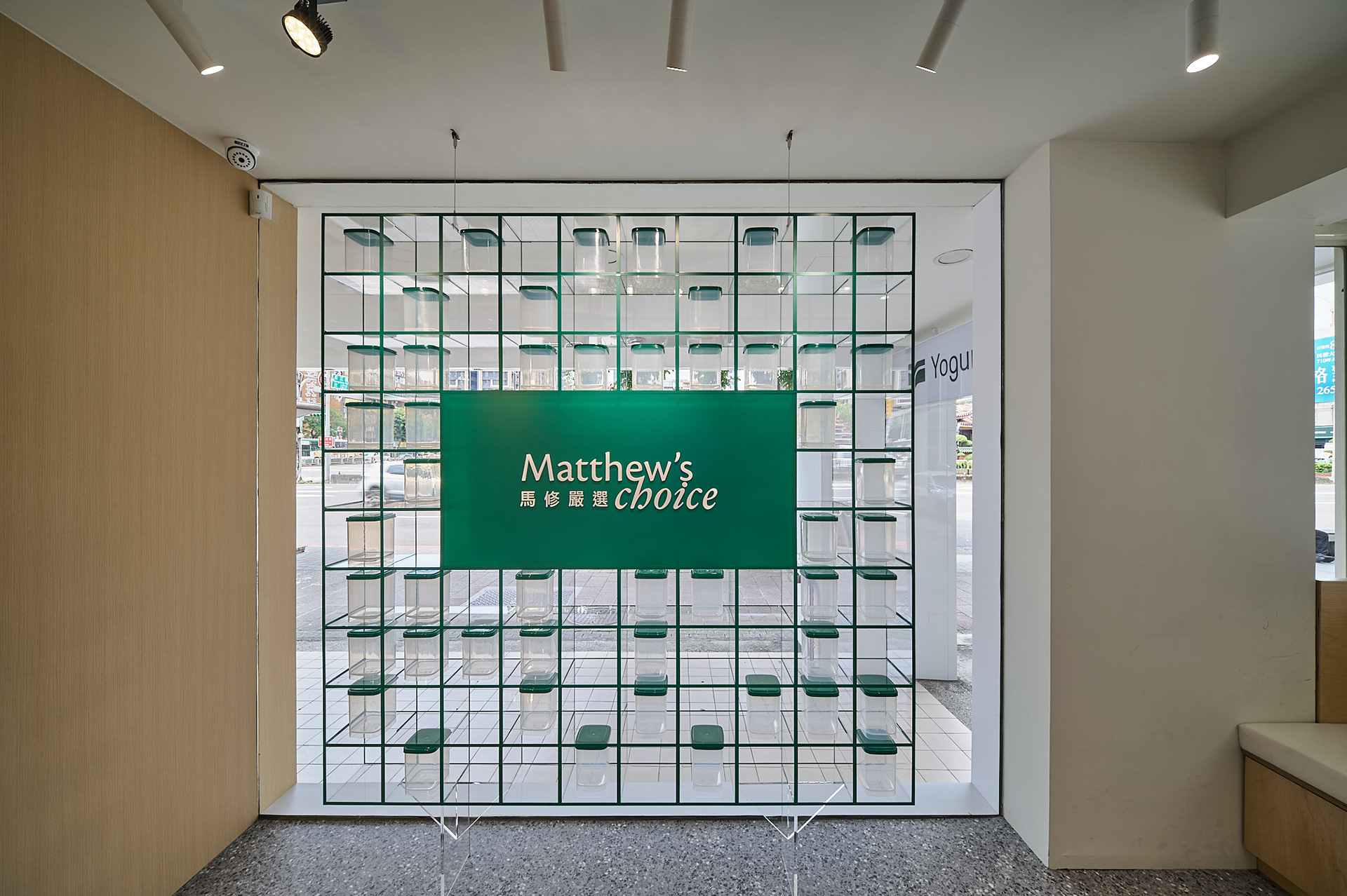
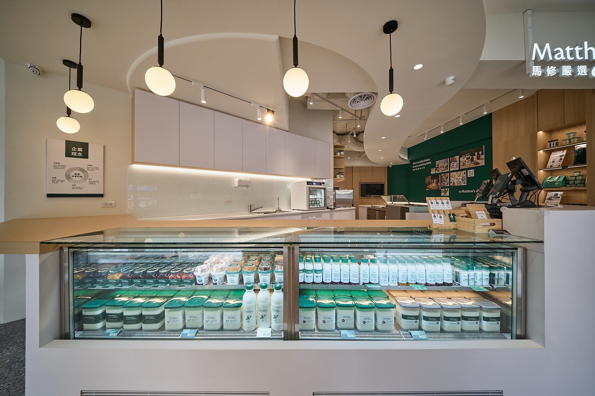
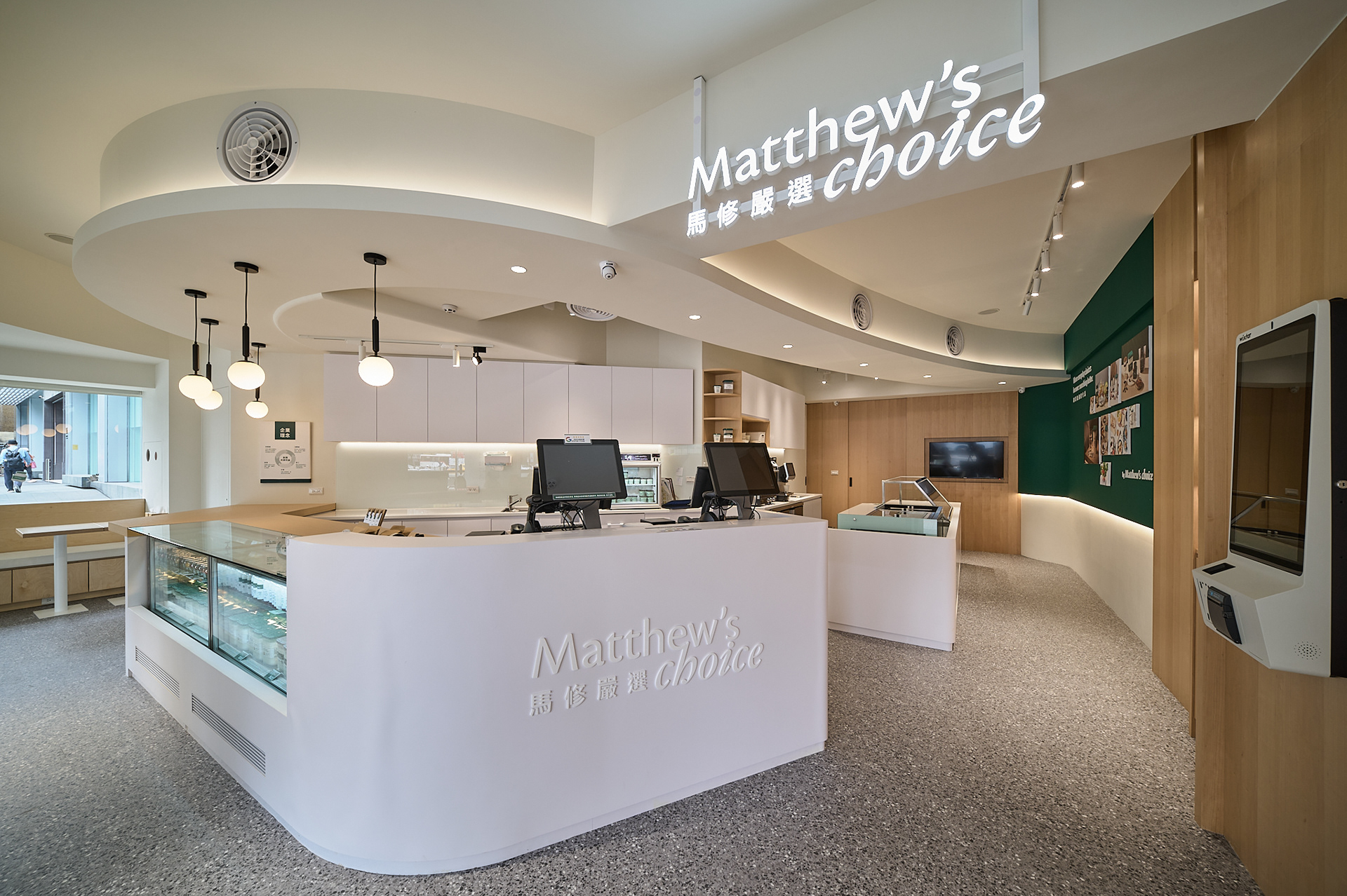
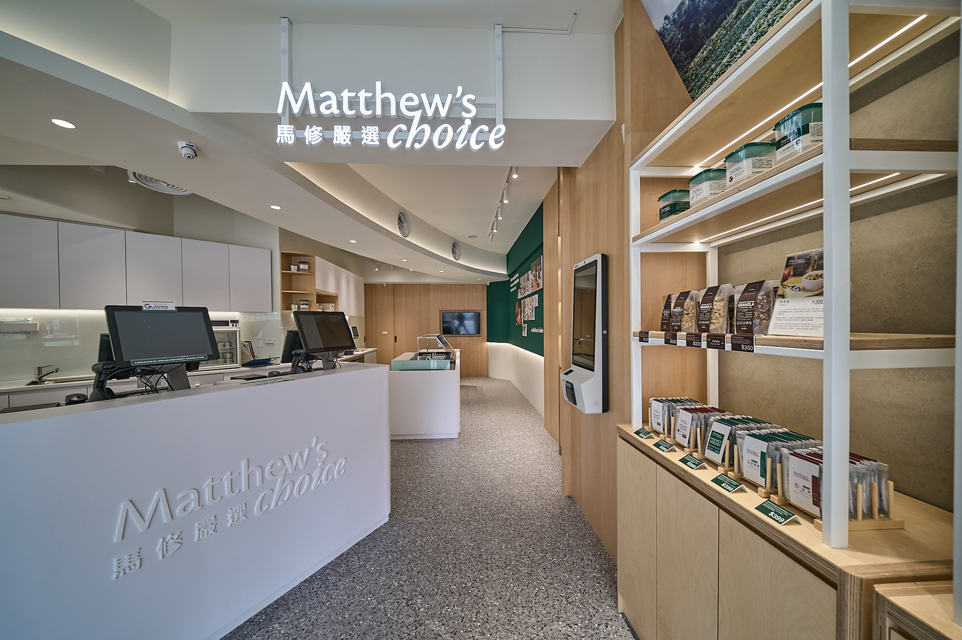
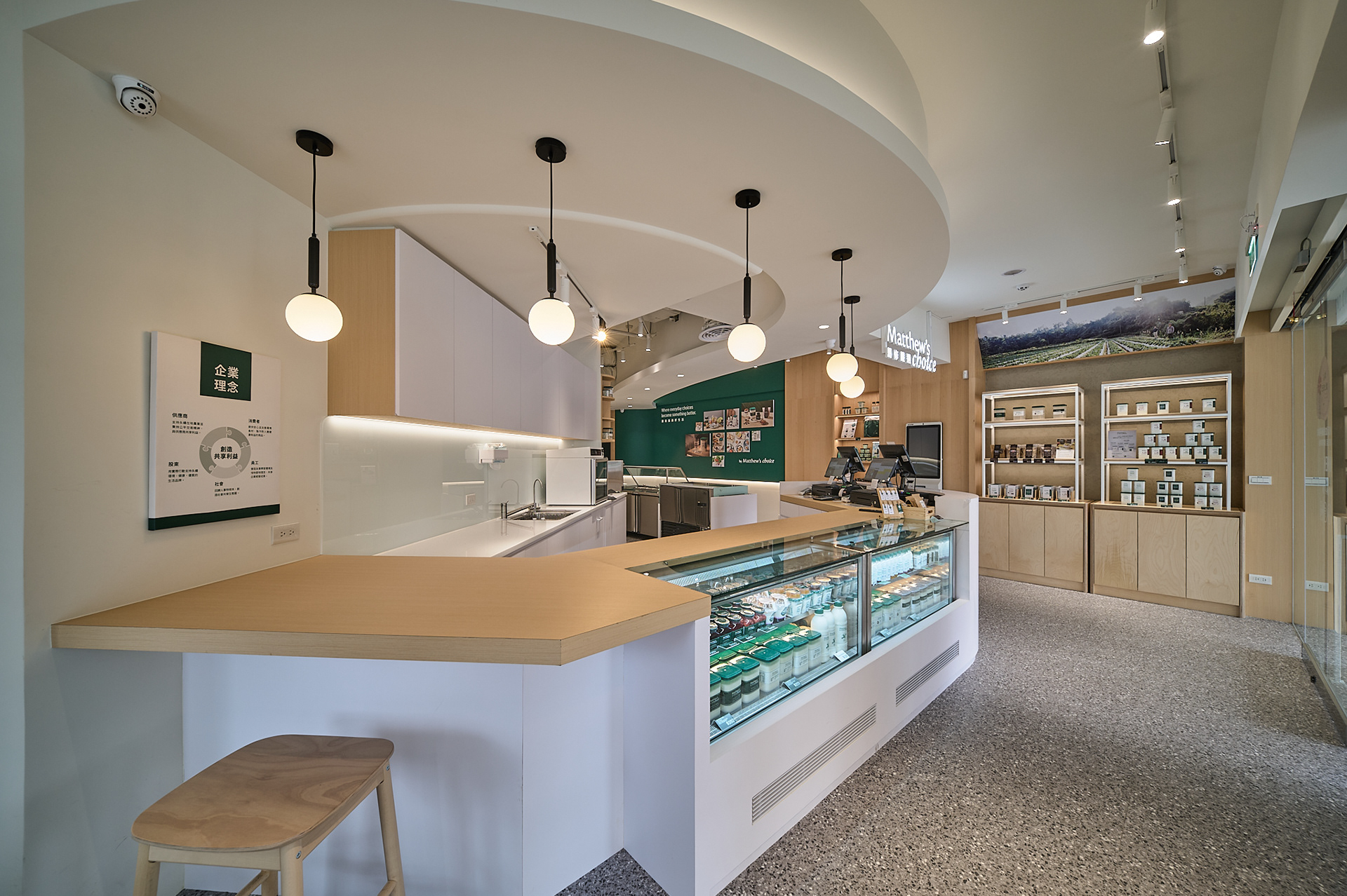
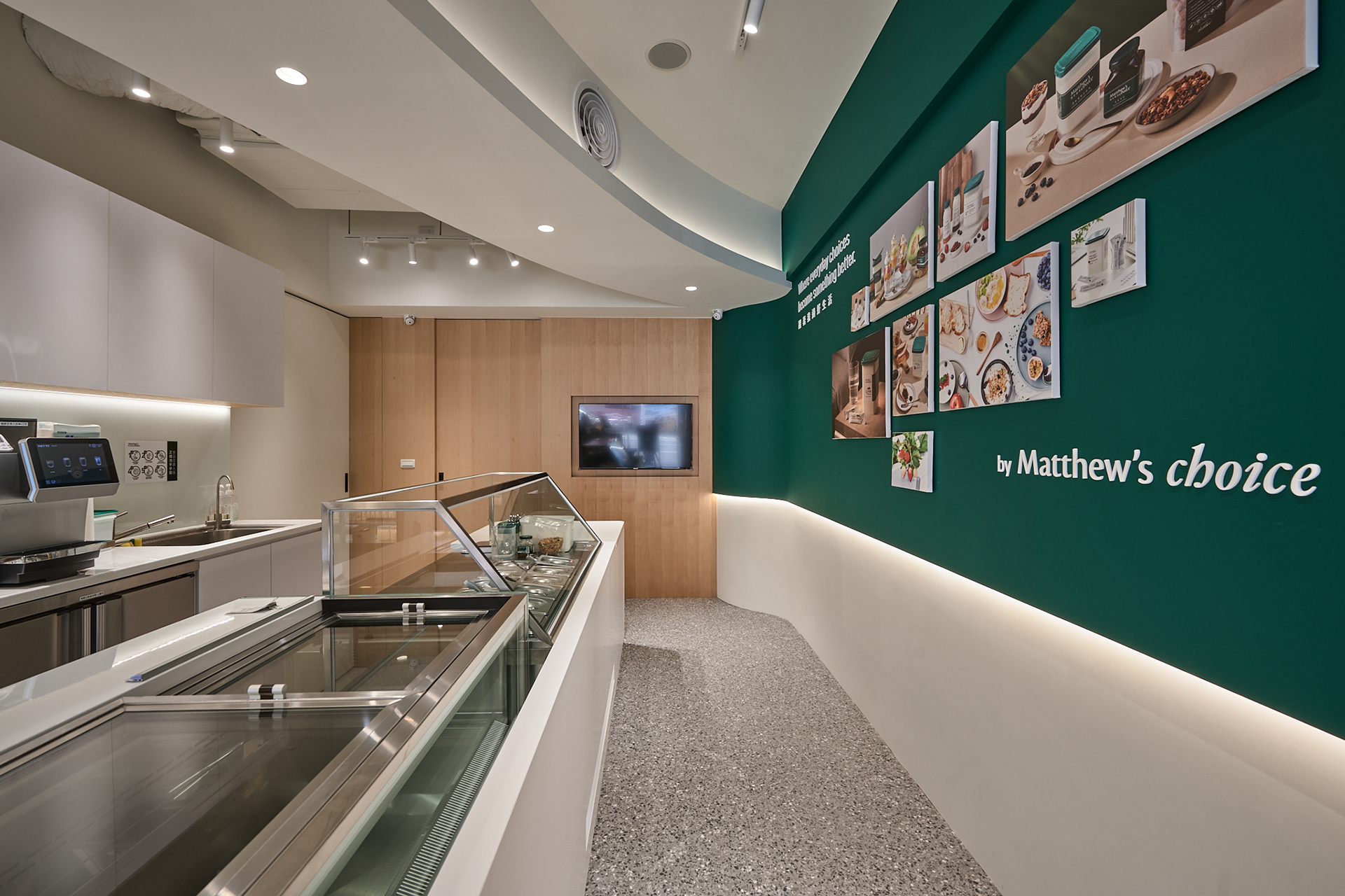
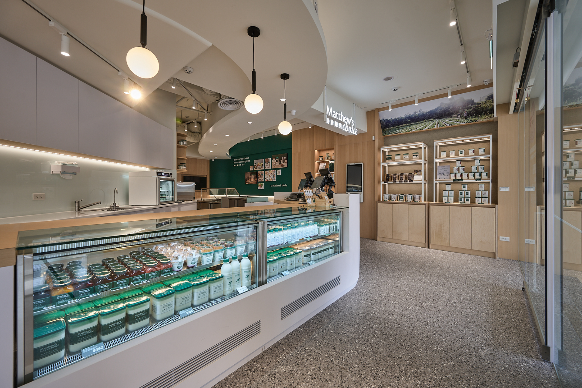
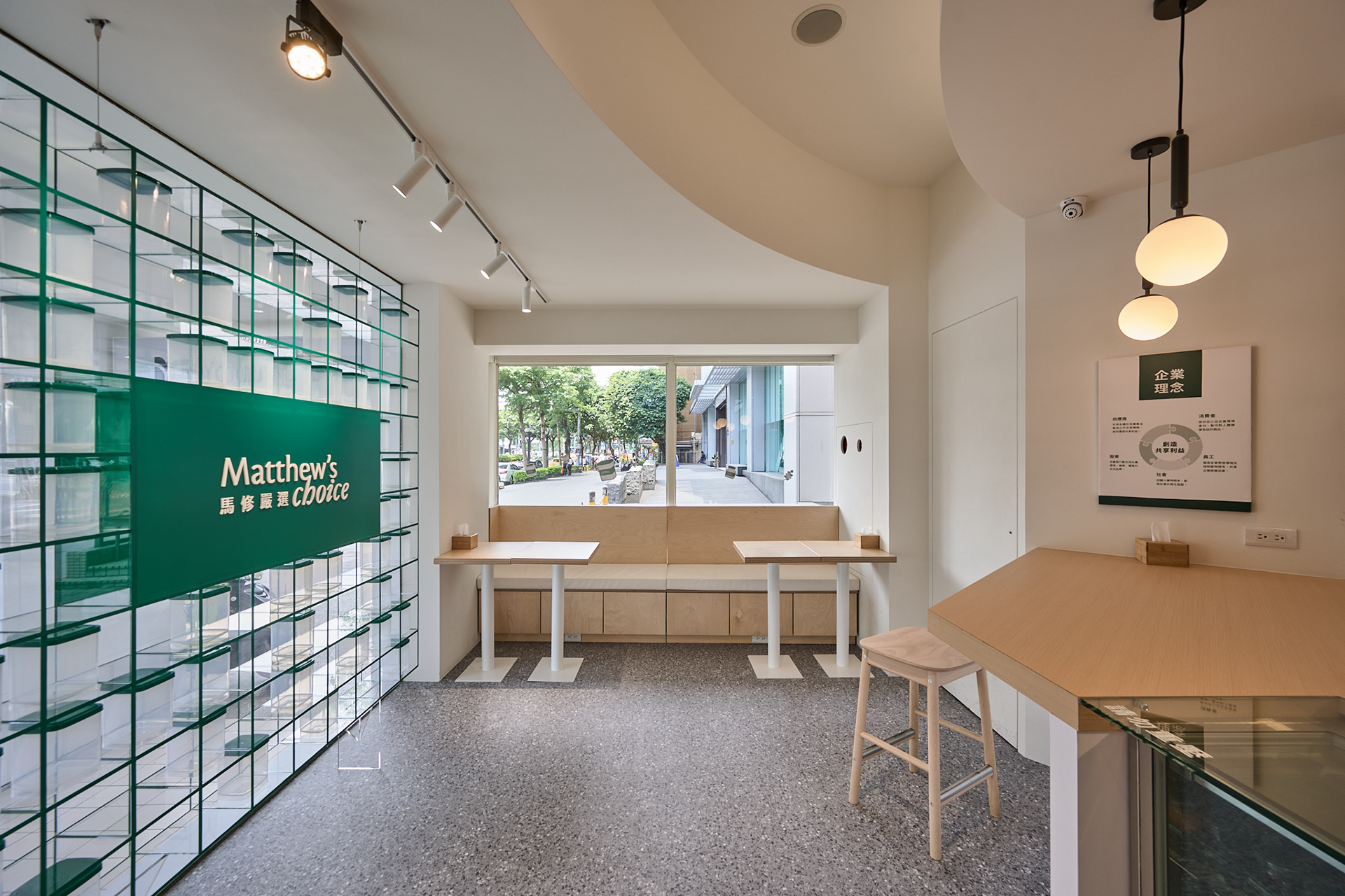
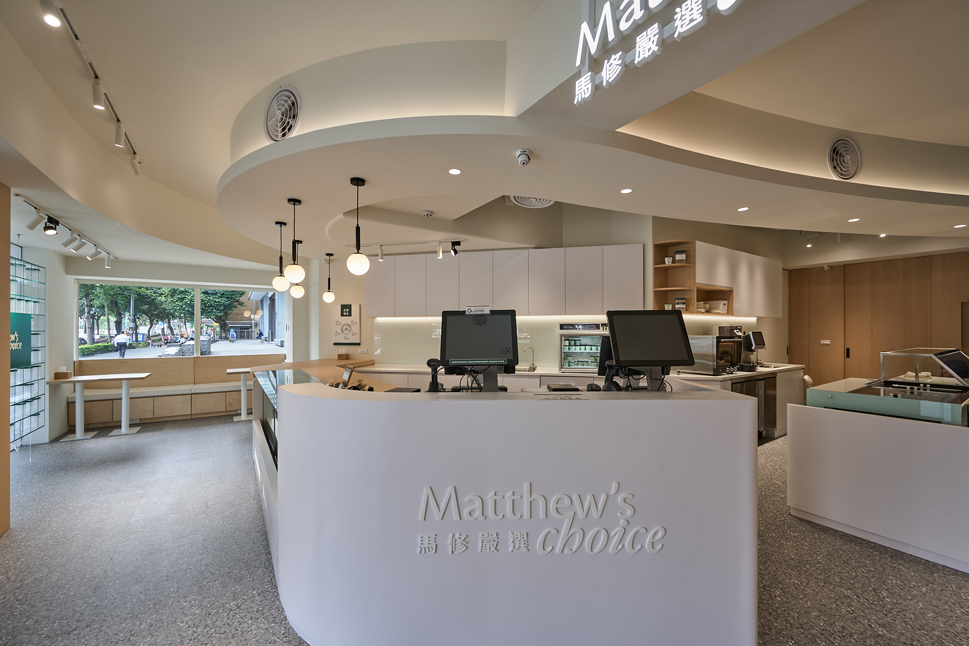
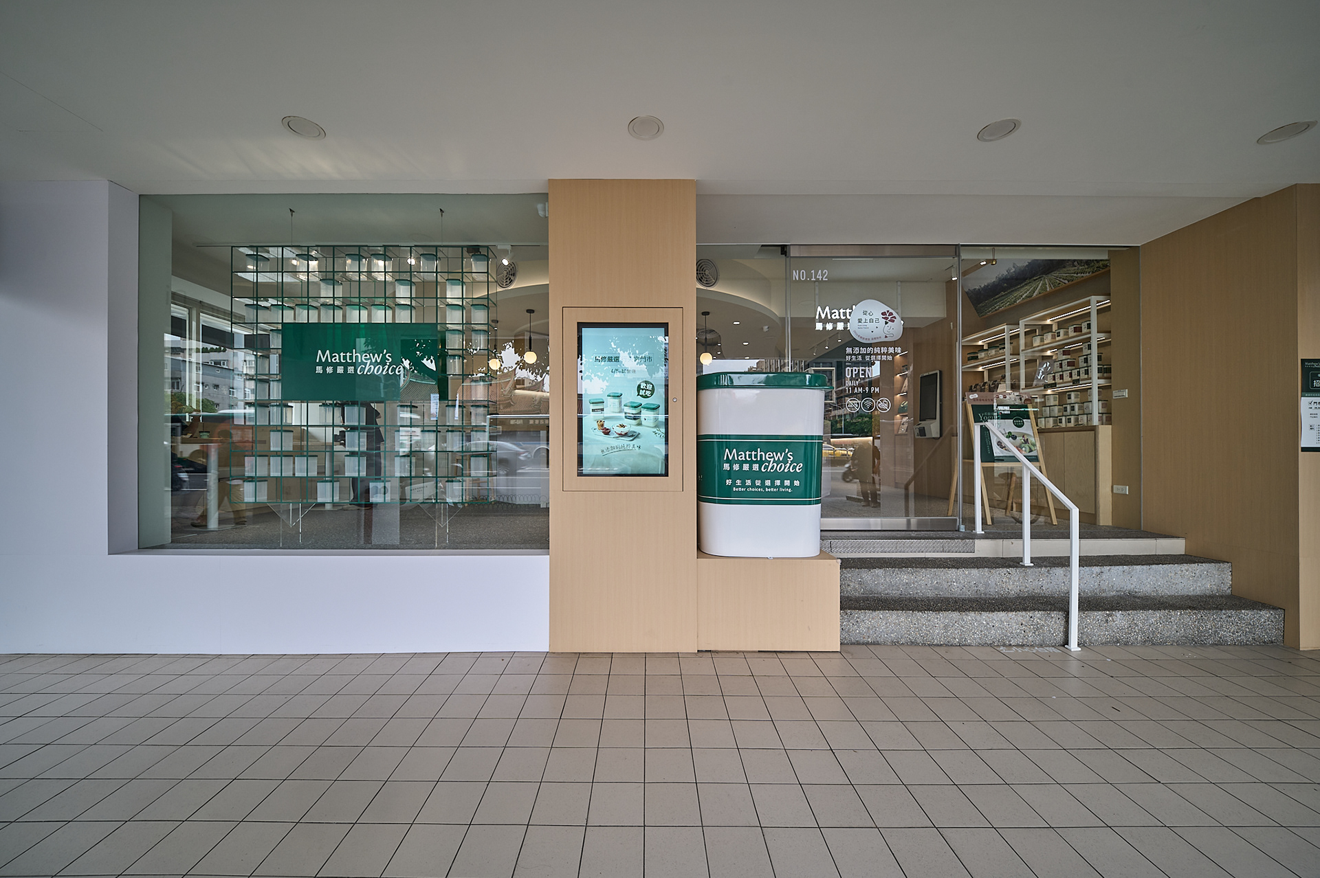
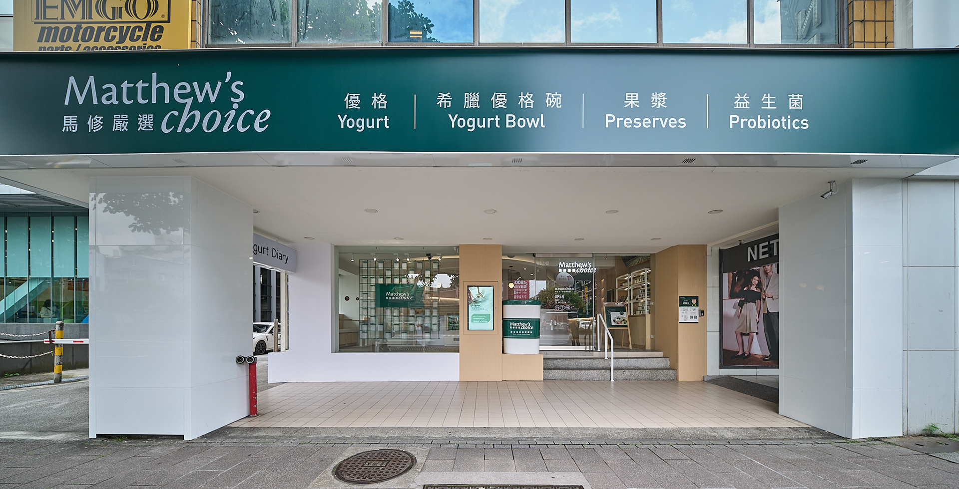
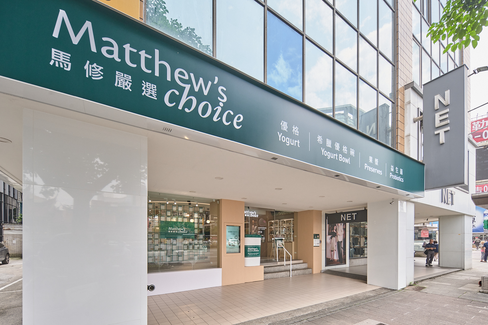
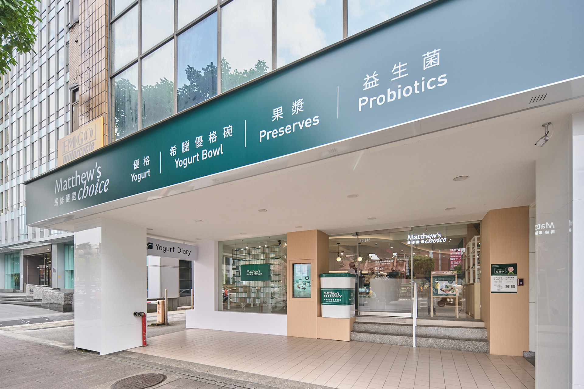
本案以「純淨、生成、流動」作為空間設計核心概念,延伸馬修嚴選對天然發酵、健康飲食與純粹生活的品牌精神,透過柔和且具有連續性的空間語彙,重新建立人、產品與日常生活之間的關係。空間不以強烈商業感作為主導,而是希望營造一種自然、放鬆且具有生活溫度的場域體驗,讓消費者在進入空間的同時,也能感受到品牌所傳遞的純淨價值。 整體空間以曲線作為主要設計語彙,透過連續延伸的弧形天花與圓角量體,形成柔軟且流動的空間節奏。曲面自入口向內部延展,空間中的動線並非制式切割,而是透過曲面串聯櫃檯、展示、點餐與停留區域,使人在移動過程中形成一種非線性、可自由感知的空間秩序。 中央櫃體作為空間核心,整合展示、服務與品牌互動機能,使消費者在不同角度皆能與產品產生視覺連結。人流圍繞核心緩慢展開,形成停留、交流與觀看的節奏,使空間不只是消費場所,更像是一種關於健康飲食與生活方式的體驗場域。 色彩與材料則延續品牌「天然與純淨」的核心精神。整體以暖白色作為基底,搭配淺木質調與品牌綠,建立清新、自然且具有安心感的空間氛圍。暖木色象徵土地與天然食材的溫度,綠色則呼應品牌對健康、有機與自然農作的重視,使品牌識別自然融入空間之中。 櫥窗玻璃展示牆以透明模組構成層層排列的界面,透明容器不僅象徵產品製程中的純淨與秩序,也形成內外之間若隱若現的視覺滲透,使街道、人群與室內活動彼此連結,而非完全切割。 This project is centered around the core spatial concepts of “purity, formation, and flow,” extending Matthew’s Choice’s brand philosophy of natural fermentation, healthy eating, and a pure lifestyle. Through soft and continuous spatial language, the design redefines the relationship between people, products, and everyday living. Rather than emphasizing a strong commercial atmosphere, the space seeks to create a natural, relaxing, and warm experiential environment, allowing visitors to sense the brand’s values of purity and wellness upon entering. Curvilinear forms serve as the primary design language throughout the space. Continuous flowing ceilings and rounded architectural volumes establish a gentle and fluid spatial rhythm. The curved surfaces extend inward from the entrance, while circulation is intentionally designed without rigid segmentation. Instead, the curved geometry organically connects the service counter, product displays, ordering areas, and resting zones, creating a non-linear and freely perceptible spatial order as visitors move through the environment. The central counter functions as the core of the space, integrating display, service, and brand interaction into a unified spatial element. From various viewpoints, customers maintain visual engagement with the products. Circulation naturally unfolds around this central core, generating moments of pause, interaction, and observation, transforming the space from a simple retail environment into an experiential setting centered on healthy living and lifestyle culture. The color palette and material selection continue the brand’s core values of “naturalness and purity.” Warm white tones are used as the primary base, complemented by light wood finishes and the brand’s signature green, creating a fresh, calming, and reassuring atmosphere. The warm wood textures symbolize the warmth of the earth and natural ingredients, while green reflects the brand’s emphasis on health, organic cultivation, and nature, seamlessly integrating brand identity into the spatial experience. The storefront glass display wall is composed of transparent modular layers that create a rhythmic and permeable interface. These transparent containers symbolize the purity and order of the product-making process while simultaneously establishing a subtle visual connection between interior and exterior spaces. The design allows the street, pedestrians, and interior activities to visually interact with one another, rather than being completely separated.